Monday, November 30, 2009

Standardized Choropleth Maps


http://www.statcan.gc.ca/pub/92f0138m/2008003/figures/5200001-eng.htm

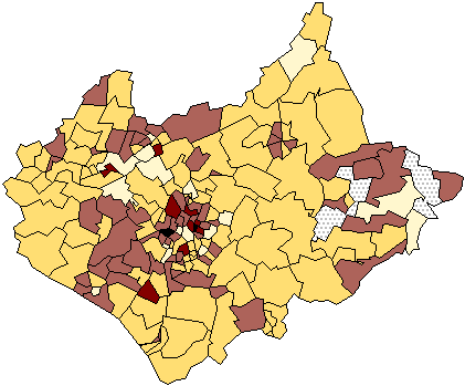
A map is standardized when its measurements are broken down in a way that allows them to be used across many different regions. This is a map of those 14 or younger all throughout Canda.
Univariate Choropleth Map


http://www.cdc.gov/pcd/issues/2007/oct/07_0091.htm

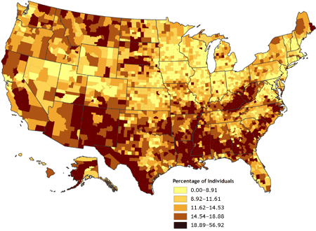
This map depicts the poverty rates for people all over the United States. It is a univariate map because it measures only one variable.

Unclassed Choropleth Map


http://www.agocg.ac.uk/reports/visual/casestud/dykes/issue3_1.htm

Unclassed choropleth maps allow for colors and shading without having to classify exactly what the colors mean. That makes this type of map widely unpopular because it makes the maps purpose unclear.

Classed Choropleth Map


http://personal.uncc.edu/lagaro/cwg/color/color_symbol.html

Classed choropleth maps used different shades of color and tenting to determine different measures of something. This map of North Caroline show how much money is spent per student in the state on public education. The data is done on a county-by-county basis.

Range Graded Proportional Circle Map

http://pubs.usgs.gov/fs/fs-004-03/

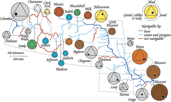
This map takes a look at water observations made by Lewis and Clark. The color of each circle denotes the color of the water (grey being no distinct color was noted). Within each circle is a triangle, and within each triangle, a black dot. The location of the black dot inside of the triangle describes the composition of the seabed.

Continuously Variable Proportional Circle Map


http://lib.utexas.edu/maps/thematic.html

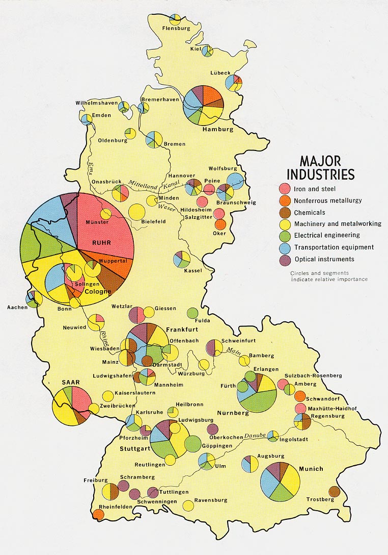
This map uses different sized circles to show how much industry is in a certain area. Bigger circles are equivalent to areas with my industry and vice versa. Within each circle, each type of industry that is in that location is represented by different colors. This makes it easy ti see which industries dominate which areas.

Star Plots

http://commons.wikimedia.org/wiki/Category:Star_plots

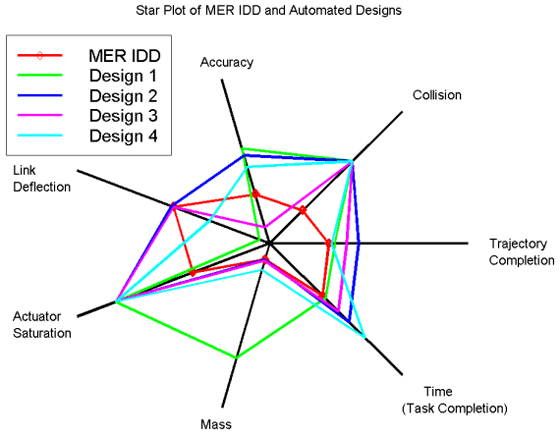
Star plots are used to measure many variables at one time. Each variable is stationed at a point around a circle, then the results are placed along lines leading out to each variable. The leads to a star-shaped graph.