 http://personalpages.manchester.ac.uk/staff/m.dodge/cybergeography/atlas/census.html
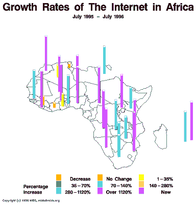
A statistical map shows changes in a certain variable. This map displays changes (or lack thereof) of internet use in Africa. For each area, a color is assigned which shows by what percentage that particular country had increased their use of the internet. Taller lines also indicate a greater increase in internet use.
No comments:
Post a Comment