http://lib.utexas.edu/maps/thematic.html
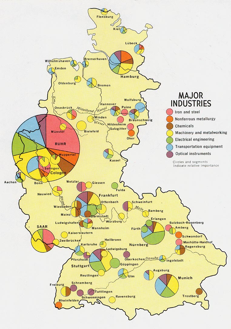
This map uses different sized circles to show how much industry is in a certain area. Bigger circles are equivalent to areas with my industry and vice versa. Within each circle, each type of industry that is in that location is represented by different colors. This makes it easy ti see which industries dominate which areas.
No comments:
Post a Comment