A map is standardized when its measurements are broken down in a way that allows them to be used across many different regions. This is a map of those 14 or younger all throughout Canda.
Unclassed choropleth maps allow for colors and shading without having to classify exactly what the colors mean. That makes this type of map widely unpopular because it makes the maps purpose unclear.
Classed choropleth maps used different shades of color and tenting to determine different measures of something. This map of North Caroline show how much money is spent per student in the state on public education. The data is done on a county-by-county basis.
This map takes a look at water observations made by Lewis and Clark. The color of each circle denotes the color of the water (grey being no distinct color was noted). Within each circle is a triangle, and within each triangle, a black dot. The location of the black dot inside of the triangle describes the composition of the seabed.
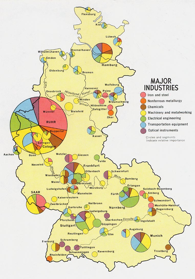
This map uses different sized circles to show how much industry is in a certain area. Bigger circles are equivalent to areas with my industry and vice versa. Within each circle, each type of industry that is in that location is represented by different colors. This makes it easy ti see which industries dominate which areas.
Star plots are used to measure many variables at one time. Each variable is stationed at a point around a circle, then the results are placed along lines leading out to each variable. The leads to a star-shaped graph.
Correlation matrices are NxN graphs that shows each items correlation to the other items. This matrix shows the correlation between income and the way that a person votes. Significant correlations are starred.
A similarity matrix uses different colored or patterned squares to show how similar two variables are. This particular matrix shows two different strains of bacteria. Ten samples of each strain were taken, and this matrix shows how similar each of the samples is to the other strain of bacteria.
This stem and leaf plot is being used to represent the ages of people at a family reunion. It can be read by taking the number in the first column and matching it up with each number in the corresponding column to the right. For example, on the second row, we learn that there were people ages 32, 34, and 37 at the reunion.
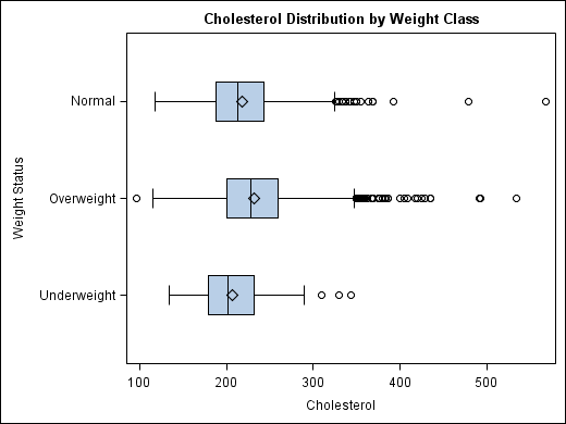
This box plot is used to display the way peoples size/weight relates to their cholesterol level. Clearly, based on this graph, underweight people tend to have lower cholesterol than those of normal and, especially, overweight people.
This histogram display how the money paid to employees in a particular company is dispersed. On the X-axis is are the salary ranges, then on the Y-axis are the number of employees who receive a salary of that particular amount.
In a parallel coordinates graph, each variable corresponds to a axis. In this case, a third dimension is added by using color to demonstrate percentage rates.
A triangular plot takes three variables and brings them to a constant in the center. This particular triangular plot displays the different types of votes that were cast in this election.
This is a windrose of the state of Maine. It is used by meterologists to determine how wind speed is distributed in the state. There is a key at the bottom right that shows what each color means in regard to how hard the wind was blowing.
This is a climograph for Moscow, Russia. Average temperatures for each month of the year are shown at the top with a line graph. Average precipitation is shown at the bottom with a bar graph. Each month is represented at the very bottom of the graph by the first letter in the name of that month.
This population profile graph displays the number of males and females there are of each age range. Males are in the blue and females are in pink. The age categories are listed on the left side where the number of males is being displayed.
A scatter plot is a graph used to present mathematical data found between two variables. In this scatter plot, elevation and mean average temperature were measure for an area. It appears that the higher the elevation, the lower the temperature.
The Lorenz Curve is often used in economics and is often used to show income distribution. The straight line on the top shows what the income would be if it was perfectly equal. The lower line shows what the actual income is line, leaving the area that is shaded red in the middle to be the area that creates the inequality between the two.
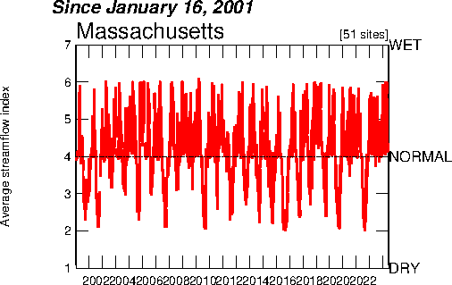
This index value plot shows the average stream flow in Massachusetts for a ten year period. And index value plot will allow you to easily see the differences in stream flow from year to year.
A bilateral graph is which shows two different variables being measured at the same time. This map measures whether people are, firstly, male or female and secondly, their political views (VL=Very Liberal, L=Liberal, C=Conservative, VC= Very Conservative).
A Digital Orthophoto Quarter Quad is an aerial picture that is taken, then it is edited to remove ground relief and camera tilt. This allows for items to be seen in their true position in relation to the ground, and allow for direct measurement (such as distance) to be taken.
A Digital Elevation Model is a digital map that shows terrain and surface topography of the ground. This is a DEM of the state of Oregon. Higher more mountainous areas are shown with dark brown and tan, while the green shows a more flat part of the state.
Digital Line Graphs are digital photos that use different lines to display different features on a map. For example, in the DLG of Columbus, Georgia, there is a blue line that represents the Chattahoochee River, black lines that represent roads, and pink lines that display differences in topographic contour.
Digital Raster Graphs are USGS maps that have been scanned. They can be used alongside other maps to determine the accuracy of current basic cartographic information.
An isopleth map simplifies data that is continuously distributed. It shows the data being displayed as a third dimension on the map. This map measure acid rainfall in the United States by looking at the pH level of rain in different areas.
Isopach maps show areas of equal thickness. In this map, dark blue is where the thickest land is, while yellow is where the most shallow spots of land are.
Isohyets show areas with the same amount of rainfall. The darkest green shows areas with more rainfall and the light green/tan shows areas with less rainfall.
An isotach is a line that shows places of equal wind speed. Using isotachs is helpful in finding the jet stream. In this map, white and light blue indicate areas of slower winds, while bright blue indicates areas with high wind speed.
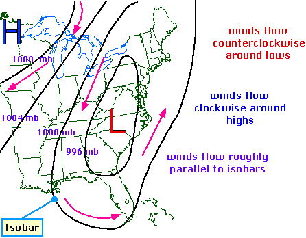
An isobar is found on a weather map and is a line that is used to connect areas of equal pressure. Each circle on this map contains an area of that has the same atmospheric pressure.
Doppler photos are created by sending out microwave signals toward something, then watching to see how the signals bounce off the object. This is a photo of a tornado within a storm cell. The red is the most severe, where the green is the least severe.
This is an aerial photo of the Golden Gate Bridge in California. NASA uses black and white aerial photos for research and to test out remote sensing in a certain area.
Infrared Aerial photos are taken with a special camera that are sensitive to a certain kind of light. This is a picture taken of the University of Wisconsin using one of these special cameras.
Cartographic animation shows changes in an object over time. Example b shows the state of Minnesota being transformed into the state of Wisconsin in gradual changes throughout time.
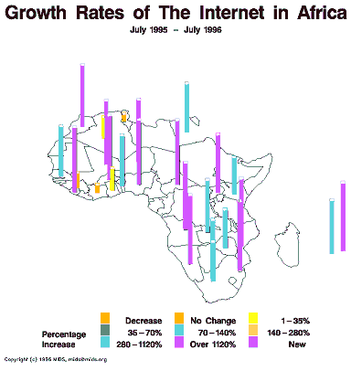
A statistical map shows changes in a certain variable. This map displays changes (or lack thereof) of internet use in Africa. For each area, a color is assigned which shows by what percentage that particular country had increased their use of the internet. Taller lines also indicate a greater increase in internet use.
A cartogram is a map in which some other variable besides actual physical representation is displayed in the map. The cartogram shown above is a map of the United States that is drawn out in regard to how populated each state is, rather than by its actual physical boundaries.
A flow map is a map that shows movement. In this particular flow map, you can see where asylum seekers in the United States originally came from because it has an arrow drawn from their original place of residence pointing into the U.S.
An isoline map is a 2-D representation of a 3-D picture. It is often used to show statistics such as population. This map takes a look at groundwater flow in China.
Proportional circle maps use different sized circles to convey different amounts or measurements. In this map, the different sized circles are used to indicate the population of Mexicans in each of the states in the U.S. The larger the circle, the greater the population of Mexicans in that state.
Choropleth maps display different statistical values for a variable in different colors or patterns. In this map, the increase in the divorce rate is measure, first by state, then by county. The brighter the shade of blue, the greater the increase in divorce rate.
Dot Distribution Maps (also called Dot Density Maps) use small dots to represent some statistical data characteristic about a particular area. On this map of the state of Ohio, each dot represents the place where a military family resides. One could deduce, from looking at this map, that the areas with the most green would be locations of military bases.
Propaganda maps are used, often by the government, to influence the general public of a certain idea. They manipulate what might be real and shape it into something that will lead an individual to feel a certain way about the topic at hand. This map demonstrates conflict taking place during the Cold War when Ronald Regan was president. This map was created to be seen by Americans.
A Hypsometric map is a type of relief map in which color is used to show elevation, etc. In this particular map, the browns and whites indicate land that is high above sea level, while the blue color indicates land that has a lower elevation.
A PLSS (Public Land Survey System) map is used in the United States by the federal government to divide areas of public domain into subsections and then sub-subsections, and so on and so forth. Within this system, land is typically divided into areas of 6 square-miles, initially, and then continue to be further divided. Markers are then placed on each corner of the square to help mark the territory. This map has divided Franklin County, Alabama into differed sections, and has numbered each column and row of the grid so that different parts of the county are more easily found.
A Cadastral Map is a map in which metes and bounds are used to establish property lines. These can be residential, local (such as the counties in the picture) or national. This system of mapping is used by many countries around the world. This map is showing the different county divisions in the state of Delaware.
A thematic map is a map that displays a physical area, but represents some other type of information, such as social, cultural, economic, etc. This particular map represents the political divisions of the United States in the most recent presidential election. The red states are states whose electoral votes went to John McCain, which the blue states represent states whose votes went to Barrack Obama. This leaves the orange states to represent states who did not declare a clear winner. This map is displayed on the news and internet during and after an election so that people are able to see how the country voted in that election.
A topographic map displays elevation of an area. This particular map uses different colors to differentiate between different levels of the land, with orange representing the highest levels of elevation and bright green representing the lowest. These types of maps tend to have many details. They display contour lines, as well as natural and man-made features of the area being displayed.
This is a planimetric map, which shows an area's horizontal position. It is similar to an aereal image, but does not show elevation. These types of maps display roads and basic bodies of water. All vertical features are ignored.
This is an example of a mental map, which shows a person's perception of what is going on in their world. This person was, obviously, mapping a town from his or her past, and plotting each of the places that specific memories were made. This map could be used alongside a story to help the listener or reader better be able to picture the placement of each landmark in the story.


 http://www.statcan.gc.ca/edu/power-pouvoir/ch9/histo/5214822-eng.htm
 http://www-vis.lbl.gov/Events/SC07/Drosophila/
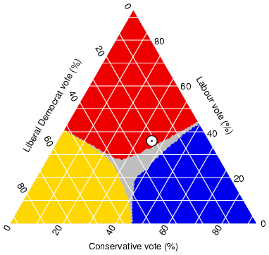 http://www.ex-parrot.com/~chris/wwwitter/20050407-it_doesnt_matter_how_you_vote_either_way_your_planet_is_doomed.html

 http://www.coventry.gov.uk/ccm/navigation/community-and-living/coventry-statistics/2001-census-statistics/


 http://ga.water.usgs.gov/olympics/columbus.html
 http://www.tceq.state.tx.us/gis/drg.html
 http://www.aist.go.jp/GSJ/dMG/dMGold/fueldb/ccop.html


 http://www.noaanews.noaa.gov/stories/s2097.htm
 http://egsc.usgs.gov/isb/pubs/booklets/aerial/aerial.html
 http://www.geology.iupui.edu/Academics/CLASSES/G303/Image_Interp/remote_sensing.htm

 http://www.cartisan.com/map_resources/map_types/flow_map.html
 http://www.unu.edu/unupress/unupbooks/80157e/80157E09.htm
 http://operationmilitarykids.ohio4h.org/resources/bycounty.html


 http://www.geocraft.com/WVFossils/Penn_planimetric_map.html